- Published on
CSS Container Queries
- Authors
- Name
- Lucas Floriani
- @lucasfloriani13


CSS Container Queries
What's new in CSS and UI - IO 2023 Edition
Responsive CSS Will Never Be The Same
@container and :has(): two powerful new responsive APIs landing in Chromium 105
A guide to CSS container queries
Basic concepts of logical properties and values
Using CSS Container Queries with Tailwind CSS
Defining Container Queries Styles
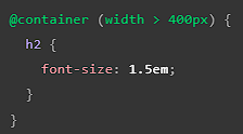
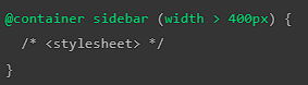
Add the possibility of media queries for expecific portions of the UI, we don't need to rely only in the viewport size anymore.

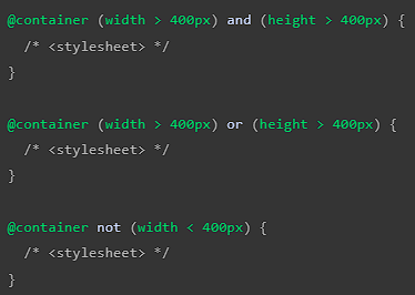
Logical keywords can be used to define the container condition:
andcombines two or more conditions.orcombines two or more conditions.notnegates the condition. Only one 'not' condition is allowed per container query and cannot be used with theandororkeywords.

Naming Containers
A containment context can be named using the container-name property.

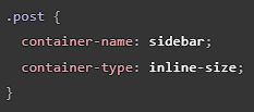
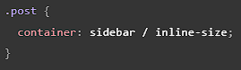
The shorthand syntax for this is to use container in the form container: <name> / <type>, for example:

In container queries, the container-name property is used to filter the set of containers to those with a matching query container name:

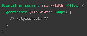
Nested Container Queries
It's not possible to target multiple containers in a single container query. It is possible to nest container queries which has the same effect.
The following query evaluates to true and applies the declared style if the container named summary is wider than 400px and has an ancestor container wider than 800px:

Experimental Container Queries with style selector
Also at the moment we have the experimental version of using style checks in the rules of @container. The following container query checks if the computed_value of the container element's --accent-color is blue:

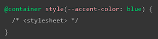
Note: If a custom property has a value of blue, the equivalent hexidecimal code #0000ff will not match unless the property has been defined as a color with @property so the browser can properly compare computed values.
Container units
cqw: 1% of a query container's widthcqh: 1% of a query container's heightcqi: 1% of a query container's inline sizecqb: 1% of a query container's block sizecqmin: The smaller value of eithercqiorcqbcqmax: The larger value of eithercqiorcqb
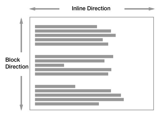
Differences between inline and block logical properties
The old way of handling CSS was by how boxes works, but sadly they don't fit good in examples where the text is vertical, to fullfill that gap the inline and block logical properties was created.
Both flex and grid are using those concepts to handle styling of elements in the DOM.

When we exchange for vertical align in CSS:

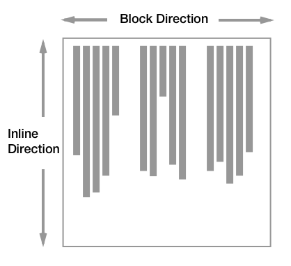
inline-size basically is the axios-x (horizontal), when we exchange the vertical writing mode it will take care of vertical elements, for block is going to be the oposite (axios-y/vertical).
container-type: inline-size only will make the axios-x available for use in the container declaration, container-type: size will make both axios-x and axios-y available.
How Tailwind Deals With Container Queries?
You need to apply @container in the element that will heald the container-type and to apply the styling you will use the prefix sizes with the prefix @, for example @md:grid-cols-2